Rapid Testing to Increase Conversion

Context
Soon after joining Backflip, I joined a newly formed internal squad focused on improving conversion from ad click to loan application. The company had recently increased marketing spend, refreshed creative, and fine-tuned ad targeting, which led to noticeable gains. But after a period of steady growth, conversion rates began to stall. It became clear that refreshing creative alone was no longer enough. We needed to revisit the landing pages and application flows the ads were driving to.
To tackle this challenge, we formed a dedicated cross-functional squad made up of myself (Product Designer), two engineers, a Performance Marketing Manager, a Senior Account Executive, and the CEO.
User Segment
Our focus was a high-potential (but historically under-resourced) user segment: ad-attributed prospects who moved rapidly from pre-qualification to loan application—typically within three days of signing up. These users made up 40–60% of new users and accounted for a significant portion of our paid marketing spend. Despite their importance, this part of the journey had received little attention. Elevating their experience became an urgent, high-impact initiative.
Goals
Primary Goal
Our main objective was to increase full-funnel conversion from ad click to closed loan. At baseline, only 0.07–0.10% of users who clicked a Backflip ad became Closed-Won Borrowers. Our goal was to double that rate to 0.20%+ by year-end. This meant improving each stage of the funnel—from landing page engagement and pre-qual flow completion to loan application quality and deal handoff.
Secondary Goal
For the vast majority of users who don’t immediately convert (~99.8–99.9%), we wanted to increase 2-week retention—especially among high-quality segments. We planned to track retention by applicant tier, with a focus on Tier 1–3 users and other strong signals (e.g., 1+ prior flip, FICO >640).
Approach
We aimed to run as many intelligent tests as possible within a 12-week period—prioritizing quality over speed. Tests were grounded in user insights, data, and informed instincts. While velocity mattered, we ensured each test was meaningful, isolated (where needed), and didn’t lead to burnout. (For the sake of this case study, I will share the most insightful tests that we ran)
The squad embedded within existing teams and tooling (e.g. Jira, Mixpanel, LaunchDarkly), with lightweight structure: three weekly syncs and a dedicated Slack channel to stay aligned and move quickly.
Discovery & Alignment
We kicked off the project with a deep-dive discovery session to get the full team aligned on the funnel and our data gaps. We walked through the full user journey—from ad click to loan close—clarifying where drop-off was happening and what we were (and weren’t) tracking. Together, we reviewed existing metrics, past experiments, targeting granularity, and our current tooling (primarily Mixpanel).
A key takeaway was the need for better visibility: ensuring we could measure each step of the funnel accurately would become early sprint work. We aligned on using Mixpanel to monitor progress and discussed journey mapping as a next step to identify opportunities and prioritize test ideas. Action items from the session included clarifying conversion rates, pulling historical data, reviewing AE call recordings, and gathering more insight into post-application handoff performance.
Starting conversion funnel metrics
Original Funnel: Customer Journey Map
Following the kickoff, I created a detailed customer journey map in Miro to visualize the full funnel experience, highlight drop-off points, and surface opportunities for improvement.
Full Customer Journey
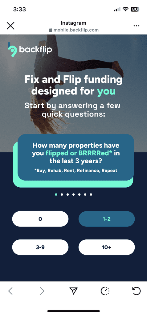
In the original experience, users who clicked a Facebook/Instagram ad were immediately dropped into a questionnaire, starting with a question about their real estate investing experience. The screen also indicated there were five additional questions to follow—creating a somewhat abrupt and form-heavy first impression.
Step 1 of Customer Journey: Pre-Qualification Questions
After completing the initial questionnaire, users landed on a sign-up screen with minimal guidance beyond the prompt: “See your loan options now.” Those who completed the sign-up were dropped directly into the loan tab of the app—no onboarding, no context—just a search bar and a list of loan products. The transition felt abrupt, offering little continuity from the pre-qual experience or clarity on what to do next. Users were left without an understanding of why they had been asked those questions, what their answers had unlocked, or what action we hoped they’d take from there.

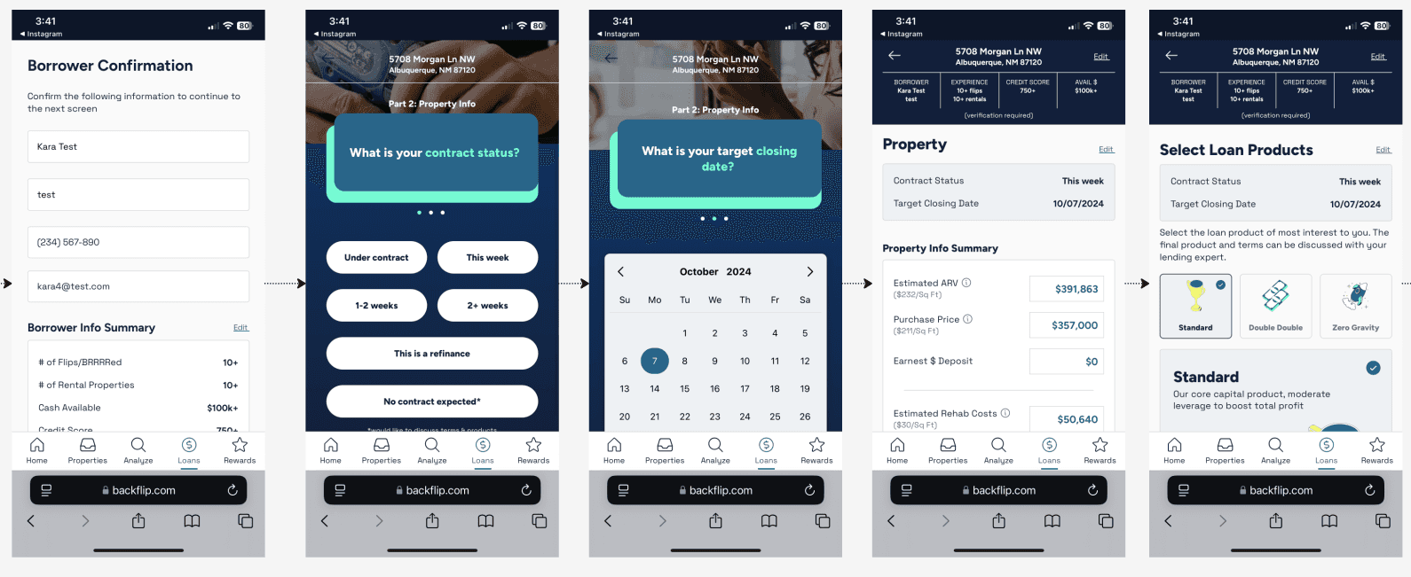
Once inside the app, users were able to start a loan by entering a property address. If no address was available, a small link offered the option to contact a lending expert, but the flow otherwise stalled. Entering an address triggered a loading screen followed by a “Borrower Confirmation” screen that pre-filled basic user info and summarized the answers given during pre-qual. However, there was no context explaining why this step mattered or how it connected to their loan options—leaving users to navigate a high-stakes process with little guidance or feedback.
Finally, users were taken back into a questionnaire—visually identical to the first—but now labeled as “Part 2,” asking for contract status and closing date. From there, they were led through yet another form asking for property details, followed by a final screen prompting them to choose a loan product and submit their application. The repeated, disconnected UI patterns and lack of clear progression made the experience feel fragmented and unclear, especially at such a critical decision point.
Brainstorming
We kicked off our first week with a collaborative brainstorm to surface ideas for improving the top of the funnel. Building on what we uncovered in the discovery and kickoff sessions, we focused on where users were dropping off, what questions might be causing friction, and how we could create a more compelling first impression. The team contributed ideas across copy, visual design, page structure, and flow adjustments. From this session, we aligned on a set of hypotheses to test—and began work on our first A/B test exploring new landing page concepts.
Landing Page A/B Test
Our first test was based on my initial hypothesis that dropping users straight from an ad into a questionnaire was too abrupt. Since Backflip was a startup, not a household name, I believed users needed a moment to get oriented. Additionally, I believed that users clicking on the ad may not necessarily be interested in, or ready to, apply for a loan. They may simply be looking for more information about Backflip. The revised experience introduced Backflip first, gave a brief overview of what we offered, and then invited users to proceed to get a loan quote or get more information about our products. We tested three variations to quickly identify which (if any) would move the needle.
Landing Page - Version A
For Version A of our A/B test, I designed a simple landing page that introduced Backflip with a bit of brand personality, set expectations for the upcoming questionnaire, and featured a single call-to-action to get started. To limit variables, we kept the rest of the flow unchanged.

Landing Page - Version A-2
While developing landing page concepts, I created an alternative to Version A. Like the original, it set expectations and introduced what was coming next—but this time, it did so directly on the same screen as Question 1. I shared it with the team for a vote on which of the two similar options to include, but we ultimately decided to include both in the test, monitor their performance for a week, and then remove the lower-performing version. The winning variant would then be tested against Version B.
Landing Page - Version B
Version B was a bit more complex. To test my hypothesis (that drop-off was due to a lack of context and that some users were more interested in learning about Backflip than applying for a loan), I designed a version that introduced our offerings while also aiming to understand the user's needs in that moment.
This version included several calls to action (five, to be exact). We knew this would likely decrease conversions, defined as users who submitted an application within two days of clicking an ad. Still, we expected it to give us clearer insight into what visitors were hoping to learn by coming to the landing page.

Implementation
We ran three test variants (A, A2, and B), each initially shown to 5% of traffic. LaunchDarkly provided analytics data, which we reviewed regularly and used to guide decisions on adjusting sample sizes as needed.
Results
Variant A1 (single CTA) had the highest conversion rate, outperforming control by 21.5%, and improved time to convert by about 59.5%.
While Variant B saw lower conversions to loan applications, we saw user take alternative paths, which proved useful for identifying intent.
Clarified UX in Loan Application
The disjointed and unclear UX of the loan application flow had been on my mind since the start of the project. I began brainstorming and experimenting with ways to streamline and clarify the experience so users would feel more oriented throughout the funnel. I shared my ideas with the squad, and we decided to move forward with a second round of testing focused on the following adjustments:
"Start a Loan" screen: Redesigned to more clearly communicate how to initiate a loan through an address search.
Loan application submission: Cleaned up the second section of the application to include more intuitive progress tracking and a clearer CTA for submitting the app to receive a final quote (while keeping changes lightweight to support rapid testing).
Registration screens: Added marketing copy and value propositions to build trust and better encourage users to share their contact details.
I coordinated efforts with my team, aligned on a timeline, and got to work.

"Start a Loan" Screen


I identified and addressed several issues with the existing “Start a Loan” screen:
Lack of hierarchy and visual clutter: The key action—starting a property search for the loan’s subject property—was overshadowed by images and product info that drew users’ attention first but weren’t interactive.
Lack of instruction or guidance: There were no clear instructions indicating that a property search was required to begin the loan application.
No value propositions: Even if users figured out how to start an application, there was no messaging about what they would gain by doing so. Additionally, since general loan rates were already displayed, users had little incentive to proceed with a quote request.
Unclear user intent: This page had one of the highest drop-off rates, but it was difficult to determine why. We couldn’t tell whether users didn’t have a property yet, weren’t interested in the rates, or simply didn’t notice the search bar.
My solutions:
Removed the product list to give the search bar clear visual priority.
Added a headline with a value proposition (“Ready to see your loan options?”) alongside reassuring guidance text encouraging users to start the property search and preparing them for the next steps (“We just need a few final property details”).
Recommended hiding the bottom app tab navigation during the ad funnel to help users focus on the task without distraction, minimizing the feeling that they had just landed in a web app.
Added a new question to the initial questionnaire to better understand where users are in their investment journey—specifically, whether they’re actively seeking funding or just exploring options.
Async Slack discussions were key for our fully-distributed squad
Results:
Loan applications created rose by 76.4% (from 1,866 to 3,291) following the UI update. The conversion rate also improved by 1.73%, increasing from 36.18% to 37.91%, indicating both higher engagement and stronger intent to apply.
Loan Application Submission

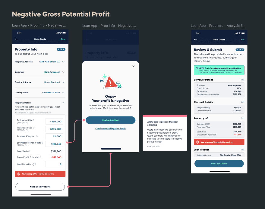
The second half of the loan quote submission flow felt particularly disjointed and overwhelming. To simplify the experience, with an emphasis on minimal rework, I designed updated screens with the following improvements:
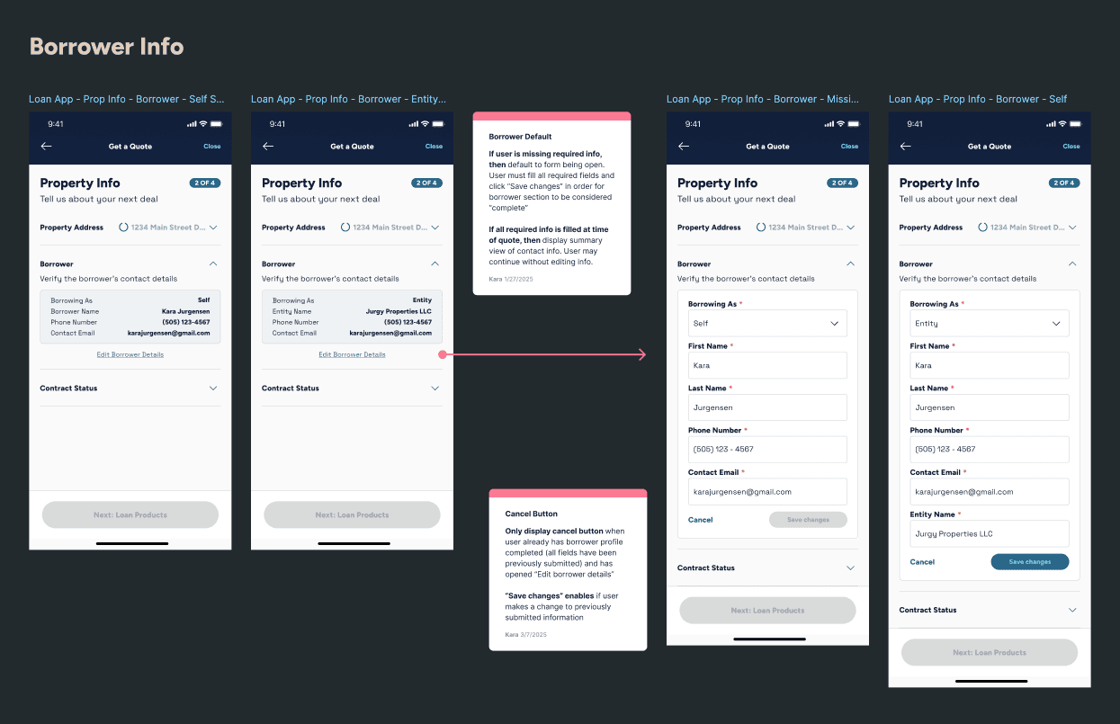
Streamlined header: The original header included borrower details entered earlier in the process, which added unnecessary clutter and distracted from the task at hand. I removed this data and kept only the essential information (the property address) to reassure users they were still completing a quote for the correct property.
Clearer, more intuitive progress tracking: The original flow felt unintuitive and poorly grouped. I reorganized it into three clear steps: Update Property Info, Select Loan Product, and Review & Submit. I also introduced our standard progress tracker component (used elsewhere in the app) and updated the navigation buttons to preview the next step, helping users feel more informed and in control.
Reassuring summary screen: I redesigned the final screen to follow a familiar “order summary” pattern, allowing users to review their inputs before submitting. To build trust, I added reassurance that the request was non-binding, information was secure, and there would be no impact to their credit. We also tested displaying loan estimates as ranges instead of fixed numbers to signal flexibility based on final details.
New addition: We added an “Application Submitted” screen at the end of the flow to support retention and increase the likelihood that users would accept their quote and continue through the lending funnel with Backflip. The screen included a preview of the next steps and encouraged users to download our mobile app to track their application and stay engaged.
Results
The test version saw 2% improvement in conversion with <20% margin of error, with noticeable improvements in UX. We shipped the test version to 100%.
Refreshed Registration Screens

For the final part of this test series, I refreshed the registration screen. In the existing experience, users were asked to create an account to view their loan options, but the screen lacked value appeal and trust-building elements. We moved forward with testing two updated versions:
A version tailored to our top-performing product ad (the Zero Gravity loan), designed to reinforce the original appeal that drew the user in.
A general version aligned with non–Zero Gravity ads, featuring stronger, more compelling marketing copy.
For both, I added a member testimonial to the second step of registration to serve as a value proposition and encourage users to continue through the funnel.
Redesigning the Loan Application UI
Previous tests had shown that even small improvements to the loan application UI led to measurable gains. Building on that momentum, we hypothesized that simplifying the flow even further, as well as reducing the time it took to apply, could drive even greater impact.
To shape our next test, I decided to work backwards by designing what I believed could be the ideal end-state UX for the entire loan application experience. While we knew the initial test would require a smaller scope, having a clear vision of the full experience helped us break the work into manageable, strategic phases.
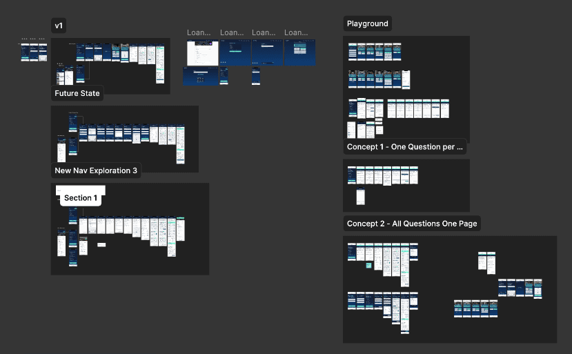
I explored many variations of navigation and question format
The core idea behind the proposed redesign was to consolidate all segments of the application into a single, consistent UI. This approach aimed to better orient users and improve retention across the funnel. I mapped out the experience into four clear steps, and included a start screen detailing each step to provide context to the user before beginning:
Check Qualification
Update Property Info
Select Loan Product
Review and Submit
Each step featured consistent progress indicators (missing from the original flow) and followed a standardized question format. Instead of splitting each question into its own screen, I used an accordion component from our RN library to keep all questions on a single page. This allowed users to focus on one question at a time while maintaining a simplified interface. It also preserved our existing tracking methods—views were triggered by accordion openings, and responses continued to be measured through tracked selections.
Before:

After:
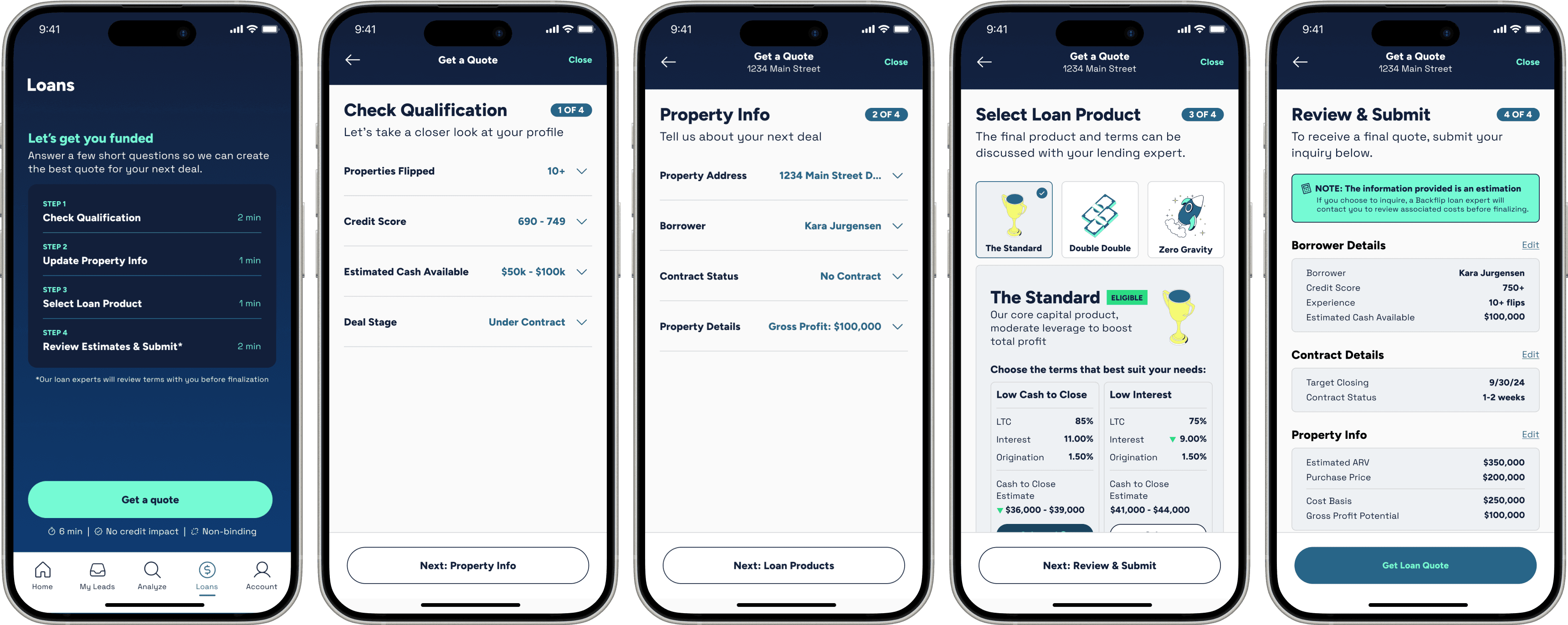
Loan application flow, start to finish: Before and After
To test the potential impact of this concept without committing significant engineering resources to a full redesign, we scoped the initial experiment to only consolidate the pre-qualification questions into a single screen using the accordion format. If the test proved successful, we planned to apply the updated design to the remaining steps in the application flow.
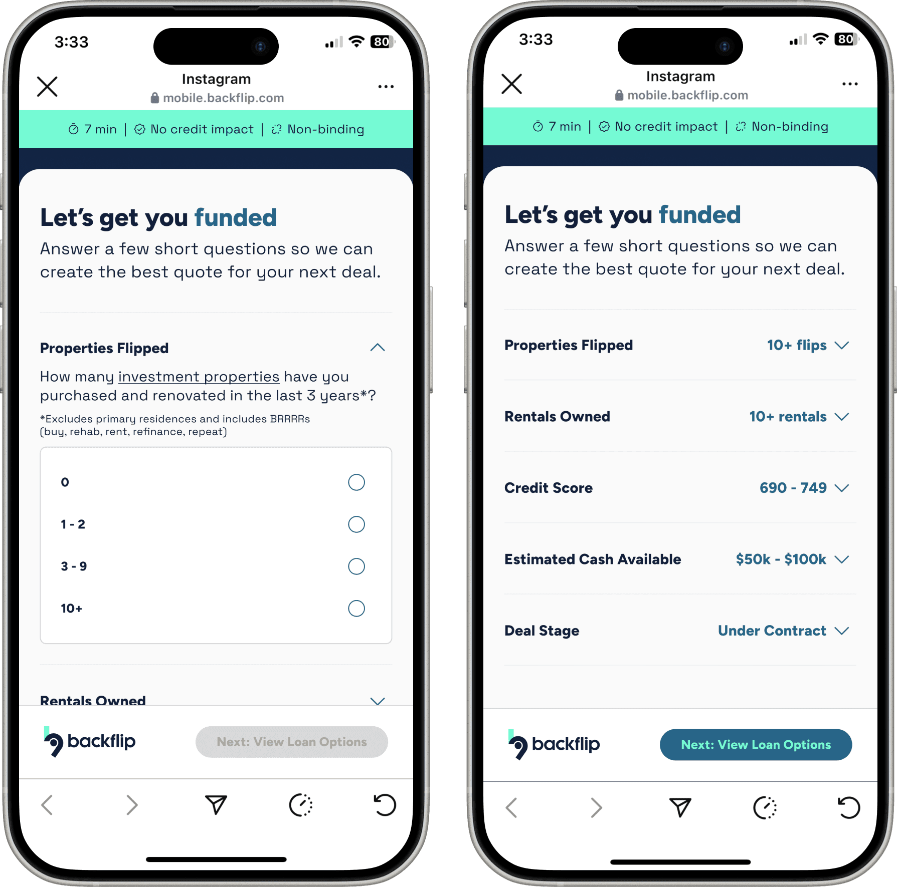
To test the potential impact of this concept without committing significant engineering resources to a full redesign, we scoped the initial experiment to only consolidate the pre-qualification questions into a single screen using the accordion format. If the test proved successful, we planned to apply the updated design to the remaining steps in the application flow.
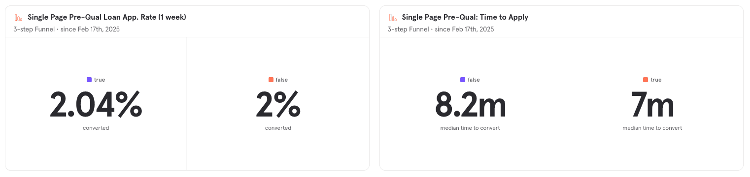
After testing, the new version (single-page accordion format) showed a slight improvement in conversion rate: 2.04% compared to 2% for the original experience. More notably, the median time to convert decreased from 8.2 minutes to 7 minutes. While the gain in conversion was modest, the reduction in time to apply suggested that the simplified flow helped users move through the process more efficiently, reinforcing the value of this design direction.
Building on the success of the initial test, we moved forward with the full loan application redesign. I mapped out the UX logic in greater detail, accounting for all states and user flows. Given the significant marketing spend driving traffic to this experience in Meta’s in-app browser, I also designed a variation of Step 1 specifically for first-time users. Using the same code base, we conditionally hid or displayed certain elements based on how the user was acquired. This gave new visitors a clearer introduction to Backflip at the start of their application, while returning app users—many of whom were submitting their second or third loan—experienced a more streamlined version.

Rapid Testing 12-Week Results
Not every test during our 12 weeks of rapid experimentation was a success—but by moving quickly, iterating often, and scrapping what didn’t work, we saw significant improvements in conversion rates by the end of the testing period.
Conversion Rate
The conversion rate from ad-click to loan application submitted improved 14.98% (from 32.74% to 37.64%, +4.9%)
Total Loan Apps
We saw an improvement of +4,322 volume of loan apps created:
May–August 2024 (prior to Squad formation): 5,918 Loan Applications Created
September–December 2024 (after rapid testing): 10,240 Loan Applications Created
Time to convert
Time to convert from loan application start to submittal decreased by 21.4% (almost 1 full minute), helping investors act earlier in their member journey on backflip
Time to convert for ad-click to application submitted decreased by 22.7% (from 5.6 hours avg to 4.4 hours)
Want to build something cool?